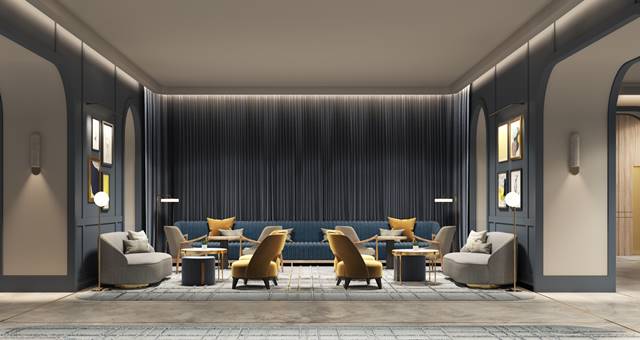
It’s a tale as old as time – first impressions last. Science will tell you that a person’s first impressions of a product, service or place are more accurate after a few seconds than after a longer period of time. And for an interior designer and the work he, she, or they, carry out on your hotel can be everything your guest needs to come through the door with open arms (more than once) or frantically scouring their phone for an alternative.
Few designers will ever try to make your hotel the perfect fit for everybody at all times – trying to be all things to all people will often fail. Instead, it is possible to develop a design concept that gives your guests that initial ‘wow’ factor enough to draw them inside, where functionality takes over and retains your guest from that point onward.
Brand standards are simply that – standards! When it comes to design, they can represent limitations and parameters – the antithesis of creativity, flow, and freedom. For the sake of innovation, the industry needs to change the term and its contents instead to ‘brand differentiators’, referring instead to a set of touch points that differentiate the brand from others. It’s important to understand that brands evolve, and trends and designers too – when working boldly – have the opportunity to become part of that evolution in a highly tangible way.

If we are going to question the relevance of designing to brand standards, we need to go back to their compilation origins. In an age when brands were a tenth of what we have today, there were also only a handful of designers then, and so a set of guidelines was developed to assist new designers in formulating a product that was intended to reflect and echo the recognisable elements of that specific marque.
As we move into the future with an overcrowded and ever-growing population of brands, the standards have begun to blur to the average guest, and a property’s aesthetic and location become the main driver and differentiator in their selection – rather than the brand itself.
Going all out on opulent luxury isn’t even crucial to achieve that brand message. Hardwood or parquet flooring, feature walls and expensive art is nice, but is just as likely to be missed entirely by your guest. A good designer will find ways to deliver that seamless look while keeping costs down.
Many designers will tell you that lighting can play a big part in improving the initial guest experience. It can be inexpensive and it can make all the difference in calming a stressed guest who is hastily powering through your front door, laden with bags from the taxi, after a long day in meetings.

The underlying need of a hotel guests hasn’t changed since the days Mary and Joseph were looking at a room at the Inn. While their needs may have been more pressing at the time, ultimately a room should have a comfortable and uncrowded bed area and a well-spaced bathroom with all the conveniences and comforts of home.
Luxury brands such as St Regis, Four Seasons and Peninsula all rely on two significant points – a high occupancy and a heavy focus on an opulent layering of soft loose items. If you remove or minimise both of these aspects temporarily, the guest will accept this as part of their experience. However, if you remove these permanently, you will end up removing a lot of the tangible perception of luxury as well as the numbers required to operate successfully.
Most operators these days offer a relatively good service – some better than others. However a service on its own is not a sufficient invitation to hang around a property, therefore design and the creativity of the space is extremely relevant for driving revenue. Every minute spent by anyone in a hotel is essentially or potentially a dollar earned, and even when designing a hotel, these metrics for every area need to constantly be reviewed.
Remember, the value of a good interior design begins the moment a guest steps into your hotel and doesn’t end until the moment they leave.

